Big UX Mistakes that will be catastrophic to any business and site
Focus
One many websites i see there is so much going on it’s a overwhelming and daunting experience of just what to do next. The very best businesses will have their websites and marketed so focused it’s hard not to know what to do. This intense laser focus increases their bottom line and conversion.
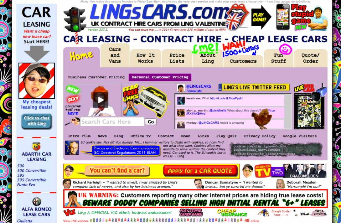
Have a look at the 1 of the worst websites in existence today. Lings Cars is famous in the United Kingdom because of it being featured on Dragons Den. It’s absolutely terribly designed and there is so much happening you have no inclination of what to do or click on there. There is so much confusion and busyness of the design, it’s a surprise she is still in business today in 2014. Boy would i love to redesign that site and make Ling a lot of money!
Slow loading
Slow loading sites can really hinder even the best of well designed experiences. It’s one of the mainstays of user experience design and always has been. Your interface has to be responsive (nothing to do with responsive web design -rwd) in terms of speed of interaction. A user clicking a link and nothing happening for 10-20 seconds is totally unacceptable.
The Oakley site was a whopping 85 megabit when it was launched, today it is a more manageable 16 megabits but thats still a large download. What if your connection speed was unreliable or you are tethering an Edge connection from your laptop? All use cases in which ram home our sites need to be fast loading on all connection speeds.
I’ve put together a website performance video which has an overview of how important site loading times are. Tips to improve speed is a second video.
Long Web Forms
Having longer web forms will decrease your completed conversion rate on those forms. Fact. No one likes filling in tedious forms and people hate filling in very long forms.
Decrease your fields as much as possible. People in marketing may think it’s a good idea but you are simply going to get a lot less completed forms. Do you want a few completed forms with multiple data input or many forms filled out with slightly less filled out fields? The answer is in most instances going to be more forms filled out.
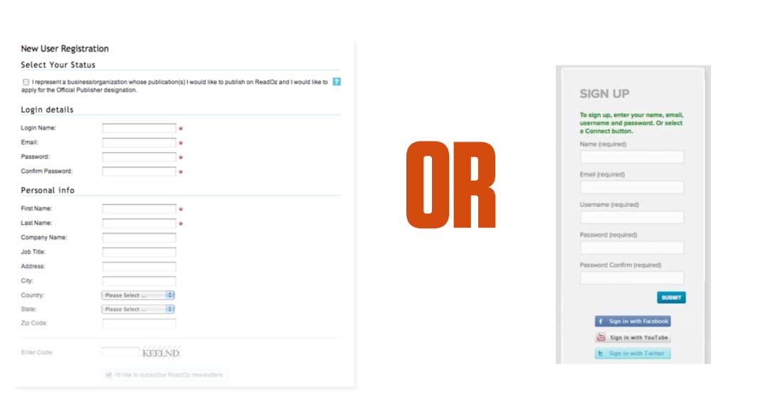
Sign up fields
In a famous example by the user experience expert Jarod Spool he increased the revenue of one online store by $300 million dollars. All he did was remove the mandatory register process from the checkout.
By removing this button and adding a short description “You do not need to create an account to make purchases on our site. Simply click Continue to proceed to checkout. To make your future purchases even faster, you can create an account during checkout.”
Some of the users stated “I’m not here to enter into a relationship. I just want to buy something.”
Some reported they couldn’t remember if it was their first time at the site and had issues with their username and passwords - another UX mistake. Provide an easy way to correct, incorrect password usage.
Don’t force users to see content or have them have to register to purchase.
Captcha
If you want to kill your sites conversion then use Captcha. It’s a horrible experience and one which should be taken away from all sites. The issue being spam however. It’s so damn hard to fill in that spam decreases. It’s hardly surprisingly it prevents spam though - us humans can even fill in the damn thing!

In the CMS i mostly use - ExpressionEngine there is an invisible spam prevention you can use and it works perfectly. I’ve seen very little spam with it. There will be other alternatives for your software of choice.
Don’t use captcha!
Other Episodes::