
Grids Part 2: How to construct a perfectly aligned responsive grid system taken from Photoshop
Process
Taking a PSD into the browsers and building up is utilising the best of both worlds when it comes to taking design into development.
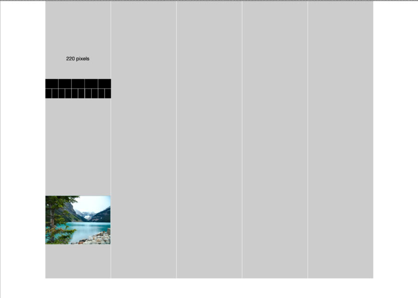
Let's use what we said in grids part one (video) about making up a grid and pretending on making up out grid from an existing image. Let's say that the image is 220px wide.
Please see the demo example and accompanying file.
Then into our design
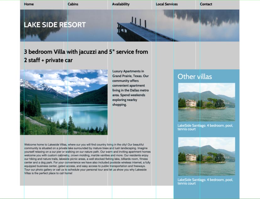
The design
- It’s not been designed
- Basic media query
- In production environment the template would need a lot of work - images, breakpoints, type, Modernizr
- Very much stripped down
- For the purpose of this tutorial it does its job
Border Box
Makes things so much easier for us
*, *:before, *:after {
  -moz-box-sizing: border-box; -webkit-box-sizing: border-box; box-sizing: border-box;
 }
What we are trying to achieve?
How to work out how to create a grid with percentage values as padding and align our elements exactly as per the static design but scale and act responsively. It would be very easy to set static values such as pixels or ems and they would align ok but it wouldn't fit into our pixel perfect grid when viewed at a different widths and devices.
Navigation
Maths: We Always need to get our parent width
22px / 1100px gives is our padding left value for the navigation
Logo
Uses absolute positioning which is fine for elements at the top of pages.
By simply setting a left value of 2% we get out logos as we want.
Big rule to note in CSS
Both horizontal and vertical % padding values are calculated from the parent elements width. This works in in our favour in most designs as we will see.
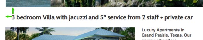
Main Heading
This time we are using different maths. Our parent element is 660pixels wide in out static design. Our gutter is the same 22px. 22/660 = 3.33333333%.
Sidebar
Total width of the parent element is 1100px and our gutter value is 22px. Padding value of 2%. This gives both our top and bottom and left and right values the exact same padding, because of the rule noted above. It works really well in this case.

It would be impossible in CSS to align our sidebar with the bottom of the main heading, so we use a bit of JavaScript to do so. JavaScript is a situation like this is acceptable but you wouldn't use too many these scripts. Always have a non JavaScript fall back.
currentHeight = $('#content h1').outerHeight();
$('#side').css('margin-top', currentHeight);
In the side bar we want the distance between the bottom of "Texas" to be the same as gutter in the sidebar. With our rule above we can do just that. The width of the parent container is 330pixels. The value we want as spacing is 22px. 22/330 = 6.66666667%.
Anything you don't understand?
Please Tweet or leave a comment.
Other Episodes::