Are you making this common web design mistake?
One of the biggest problems with websites is that everything is grabbing for attention. When everything is grabbing for attention NOTHING gets attention! It's too busy! You want to focus and guidance for the visitor.
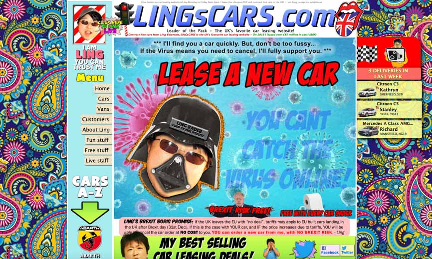
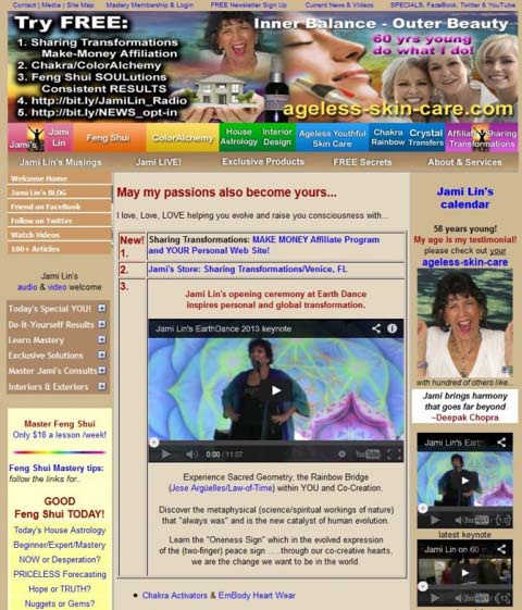
2 examples of very busy websites with many elements vying for attention.
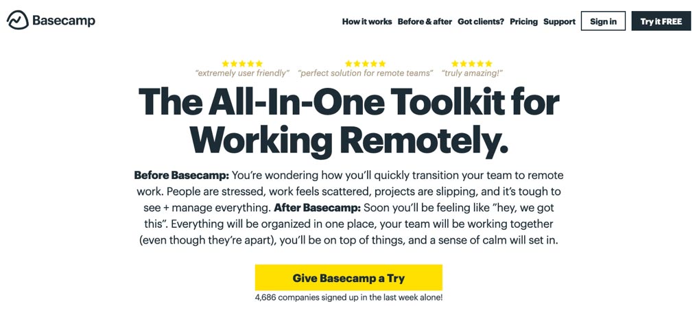
Solve it with hierarchy
You want to have a very clear structure for your content. Your headline has to grab attention.


Tottta (The One Thing To Take Away)
Use hierarchy to grab attention